This is a somewhat trivial request, but it's about a typographical pet peeve I've been noticing for a few months. I figure I might as well make a request about it.
Problem 1 of 2: The H2 and H3 have poor spacing.
Our heading spacing is off, which reduces the legibility of our H2 and (especially) H3 and any post that actually uses them. That discourages a lot of us from actually using H2 and H3. It seems in general the community prefers using H1's, and a single bolded line as a mock-heading rather than H2 or H3. Other SE sites don't appear to have this formatting issue.
Headings are meant to have a gap above to separate a new section from the previous one, and then be snuggled in nice and close to the text of the new section to identify it. Alternately, they just have equal space above and below.
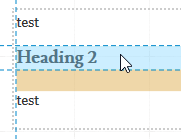
Our heading 2 and 3 do the opposite, because they have a margin-bottom: 1.2em CSS declaration that places them closer to the text above than their following paragraph.
(the orange bit is the margin)
Problem 2 of 2: The H3 looks too similar to normal bolded text.
The heading 3 ought to be made larger. It's virtually indistinguishable from normal bolded text. This means using it usually reduces clarity if anything. Combined with the spacing issue, that makes the H3 unusable (except for the purposes of making your post worse somehow).
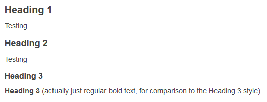
Our H3 is 16px vs the body text's 15px, and it has a different font face (the LusitanaRegular webfont vs the body text's Georgia), but LusitanaRegular has smaller text so these differences add up to be negligible. To demonstrate, I'll let you guess which of these is the H3.
Example
Example
So what do our headings currently look like?
Heading 1
The spacing above and below the heading is about equal. This is currently my favourite heading to use on the basis of its legibility.
Heading 2
The spacing places this closer to the text above than below.
Heading 3
Just like the H2, this is closer to the text above. Because it's also smaller, it gives the impression of being a lot closer to the text above.
What should our headings look like?
The appearance of the headings on Meta Stack Exchange is shown in the below image. Good spacing, good sizing: no legibility issues.
On our site it should really look like this (it's an image).

- The size changes are necessary because we're increasing the H3's size to distinguish it from regular bolded body text (19px is the minimum size). H2 and H1 then get their size increased as well to maintain the present 2px gap between each heading's font size.
- A margin-bottom of 10px is what Meta Stack Exchange uses for H2 and H3.
- It hasn't been included here, but a margin-top of 1.2em or 24px would push headings further away from the paragraph above, and might improve their distinctiveness. This is a matter of preference though, and Stack Exchange seems to prefer equal spacing above and below. (It's also my own preference, but I'm happy either way.)
So in total, the changes are:
.post-text h1 {
    font-size: 23px !important; /* previously 20px */
}

.post-text h2 {
    font-size: 21px; /* previously 18px */
    margin-bottom: 10px; /* previously 1.2em */
}

.post-text h3 {
    font-size: 19px; /* previously 16px */
    margin-bottom: 10px; /* previously 1.2em */
}
(Community input welcome. I'll adjust accordingly.)


.post-text h2and.post-text h3\$\endgroup\$emtopxseems weird. Also, the headings should still be a bit closer to their following paragraphs, IMO. \$\endgroup\$pxremains common for practical reasons. (That comment aside, still won't let me upvote harder.) \$\endgroup\$