18
\$\begingroup\$

Hi all. I'm Jin, and I'll be working on the designs for the Stack Exchange sites as they graduate from the beta phase. Each site will have its own unique theme that will reflect its topic. However, all sites will share quite a bit of common elements so they feel like they're part of the Stack Exchange family.

I'm in the very early stage of brainstorming about the design for the RPG site's final theme. Before I go any further, I'd like RPG.se community's opinion on the direction I'm thinking about.

Looking at the types of questions and popular tags, it seems a lot of them are about D&D. The design I have in mind is very graphics heavy around the shell of the site(headers, footer, site background). I'm thinking about using Medieval graphical elements, vintage paper texture, grunge effects, dragons, dice etc. Basically, a more subtle version of http://www.worldofwarcraft.com or http://www.wizards.com/dnd/Community.aspx

I think it'd work well for the RPG.SE site. However, I was wondering if such a design would alienate other types of RPG gaming questions?

If you have any other design ideas for the site, please let me know.

BTW, I really like the dice logo idea proposed here

\$\endgroup\$
1
  • 2
    \$\begingroup\$ Rumours abound Jin, what can you tell us? \$\endgroup\$ Commented Jan 10, 2012 at 15:27

9 Answers 9

25
\$\begingroup\$

For the header, I agree with making it more 'genre inclusive' and not D&D specific - the heavy D&D 4e focus is one we're trying to overcome to serve all RPGs. Hitting the majors (scifi, fantasy, horror, supers) would be nice.

Also, make sure it screams pen-and-paper/tabletop RP - we get a lot of confused people wandering through here asking about computer MMOs. I think strong use of dice, "people around a table," pencil/graph paper, miniatures kinds of elements would be helpful there.

(Ooo, in fact, if the iconic genres were each represented by a character that looked like an unpainted lead miniature that would be a cool effect...)

On the dice, use them all but I would tend towards d20 as the major iconic die people associate with RPGs. D&D uses it but so do many others. d6 risks confusion with normal boardgamers/wargamers who all use d6es exclusively. I like the "dice tower" being of the varied RPG dice and if a favicon needs one, I'd go d20.

I look forward to seeing what you come up with!

\$\endgroup\$
4
  • 1
    \$\begingroup\$ +1 for avoiding the d6. (and other good points) \$\endgroup\$
    – Pat Ludwig
    Commented Nov 29, 2010 at 17:03
  • 3
    \$\begingroup\$ +1 Even as a person who hasn't played a d20-based system since about 1983, I agree that a d20 still says "RPGs" to me! \$\endgroup\$ Commented Nov 29, 2010 at 22:27
  • 12
    \$\begingroup\$ +1 for making it genre-inclusive rather than D&D based. I'd go for the focus on dice, rather than iconic genre characters. \$\endgroup\$
    – Graham
    Commented Nov 29, 2010 at 23:00
  • \$\begingroup\$ I like this idea a lot. I prefer inclusion of all common polyhedral die, (d20, d12, d10, d8, d6, d4) but the d20 is definitely the icon of TTRPGs. \$\endgroup\$
    – Iszi
    Commented Dec 3, 2010 at 19:11
10
\$\begingroup\$

I'm going to dissent a bit from the trend so far—I don't like the idea of bluntly representative pictures to get across the point of the site. I'd much prefer that the graphic design look like a web page with tightly-woven graphic elements, rather than a page with pictures plastered about.

So I do like the idea of

using Medieval graphical elements, vintage paper texture, grunge effects, dragons, dice etc.

… but to include other genres, why not include anachronisms into those Medieval designs? What would a laser blaster drawn by a Benedictine monk look like? A hint of sepia-washed Cthulhuoid tentacles nibbling at the footer, threatening all above? Perhaps the vintage paper texture has a tear, revealing the control transistors of a e-paper device. Maybe the dragon is wearing a dashing fedora and a trench coat. A fairy-tale castle turret, with robots guarding the parapet, overlooking a superheroes-style mad scientist with a doomsday device? *

Grungy post-apocalypse tech aesthetics and fantasy aesthetics blend together well, too. I could see the site name done up in a large, illuminated-manuscript style, while the site's tagline is displayed on a grungy, dim-lit, exposed-wires LCD marquee that's fit through a rough hole punched in the vellum beside the illuminations. (For an unnecessarily-detailed example. * )

Basically, I'd personally like to see a unified graphical feel, but have the details within that look betray the mixing of genres that RPGs naturally incorporate. There's no reason we can't have subtlety and flair while making it obvious that this ain't no fantasy-land exclusive.

*I realise a lot of that is more detailed than what can fit into, say, the vote arrows or tag styling, but it's the concept I'm trying to get across rather than implementation. I value a designer's good judgement more than their willingness to be the client's text-operated Photoshop inteface. ;)

\$\endgroup\$
5
  • \$\begingroup\$ Sounds very steampunk ... not sure if that's a good or bad thing. \$\endgroup\$
    – C. Ross Mod
    Commented Nov 30, 2010 at 13:30
  • 1
    \$\begingroup\$ @C. Ross: Again, I'm not being literal with the examples, just using them as examples of how we can have our genre-mixing cake and eat it in a unified look too. If it all looks like an illuminated manuscript but with anachronisms in the drawings, that'd do the trick too. \$\endgroup\$ Commented Nov 30, 2010 at 16:12
  • \$\begingroup\$ Well, I don't think that the other option has to be "a page with pictures" as opposed to "tightly woven graphic elements..." I would assume Jin would craft the latter from whatever core ideas are presented. \$\endgroup\$
    – mxyzplk Mod
    Commented Dec 2, 2010 at 2:38
  • \$\begingroup\$ @mxyzplk I know enough designers to know that assuming they know/making them guess what the client really means is a recipe for sadness pie. I saw a distinct rejection of Jin's core concept, with a focus on what objects to put in a picture to advertise genre-inclusiveness. My answer is in that context. If the concept isn't rejected, that should be said. \$\endgroup\$ Commented Dec 2, 2010 at 4:57
  • 4
    \$\begingroup\$ I am now going to roll up a laser blaster wielding Benedictine monk. \$\endgroup\$
    – LeguRi
    Commented Dec 3, 2010 at 18:45
8
\$\begingroup\$

I don't know if it's already in this "thread" but a few people expressed an appreciation of the beta layout - that is, it's pen-and-paper feel.

It would be fun for user profiles to be arranged a little more like character sheets :D

Edit

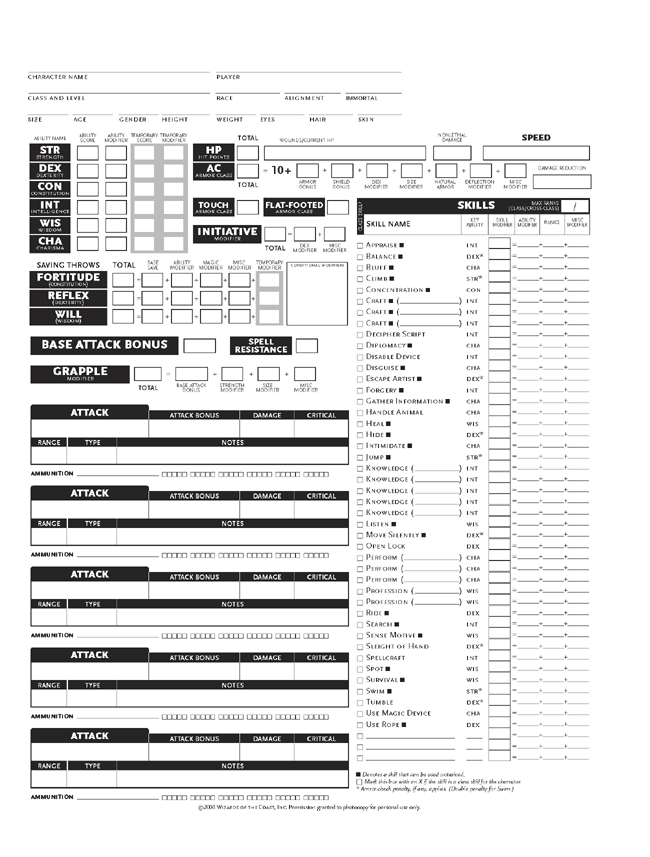
Here is a DND 3.5 character sheet; it's the game that got me hooked so it's the first I add.

Sorry for the delays; between being busy and not owning a scanner it took me a while to think of "Google Image Search: DnD Character Sheet" >.<

enter image description here

\$\endgroup\$
4
  • 3
    \$\begingroup\$ Can you screenshot your favorite character sheet and post it here for Jin's benefit? \$\endgroup\$
    – C. Ross Mod
    Commented Dec 3, 2010 at 20:16
  • \$\begingroup\$ @C. Ross - Excellent idea! I'll try and get some, though I have a busy week. \$\endgroup\$
    – LeguRi
    Commented Dec 5, 2010 at 1:14
  • \$\begingroup\$ Just a little reminder. \$\endgroup\$
    – C. Ross Mod
    Commented Jan 11, 2011 at 18:22
  • \$\begingroup\$ I love the idea of using a character sheet, but there are others out there that are much more interesting and less utilitarian. \$\endgroup\$
    – RMorrisey
    Commented May 7, 2011 at 0:25
7
\$\begingroup\$

For the large header, a wooden table with a fantasy iconic character (orc, dwarf, or ::shudder:: elf), a supernatural (vampire, probably) and a sci-fi roboty/anime character rolling dice could be quite evocative.

A pure D&D theme would give entirely the wrong idea, and emphasize D&D more than it should be.

For vertical bars, "dice towers" would be completely awesome.

\$\endgroup\$
2
  • 4
    \$\begingroup\$ And everything is better with tentacles! :-) \$\endgroup\$ Commented Nov 29, 2010 at 22:28
  • 4
    \$\begingroup\$ @Dave, No, no it's not. shudders \$\endgroup\$
    – C. Ross Mod
    Commented Nov 30, 2010 at 13:13
5
\$\begingroup\$

I like the generic grid paper. Add some dice and pencils.

\$\endgroup\$
3
  • 1
    \$\begingroup\$ Yeah, at first I thought this was the RPG design, what with the graph paper and penciled lettering/arrows, until I realized it was the beta design. :) \$\endgroup\$
    – Jason S.
    Commented Jan 13, 2011 at 23:32
  • 1
    \$\begingroup\$ Same here! @JasonS. \$\endgroup\$ Commented Jan 10, 2012 at 15:17
  • \$\begingroup\$ @JasonS. Yes, indeed, for me too. I like the design, but adding dice towers would be nice. \$\endgroup\$
    – Stephen
    Commented Jan 10, 2012 at 18:25
4
\$\begingroup\$

Yes, there's a risk to misrepresent futuristic settings, or gothic ones. It's a difficult tradeoff, but focusing on fantasy alone for the design is probably not representative of the roleplaying community as a whole.

So, what about a graphical header that combines all the aspects? on the left, fantasy/gothic. In the center steampunk and current day. On the right, futuristic/robots. It's hard to pull this off without a cartoonist, though.

Font should be pen-stroke but readable. We mostly use pen and paper, it makes sense we stay on this tone. As a "accepted answer" counter, I have no idea. One request I have is to have "XP = reputation_value", and of course badges are gold/silver/copper coins.

\$\endgroup\$
1
  • 2
    \$\begingroup\$ I'd like the idea for badges, but our coins should be ... archaic looking as opposed to Gaming's 8 bit style. Also, if the mod diamond could be a futurist looking gem, that would be awesome. \$\endgroup\$
    – C. Ross Mod
    Commented Dec 1, 2010 at 13:29
4
\$\begingroup\$

I think we want to keep it relatively simple; it should be mixed, but not just throw in random different elements. An idea of how to mix things together: set the stage as a single encounter, a classic fantasy beast against a mixed-genre adventuring party.

An overhead view... a dragon rears his head at the top corner of the page. He breathes fire at a bunch of adventurers. The adventurers are assorted fantasy, sci-fi, cyberpunk, horror:

  • A mythos investigator examines the dragon-fire with a magnifying glass, to see how hot it is
  • A cyber-troll stands in the edge of the fire, blazing away with an assault cannon
  • A vampire fades into shadow to avoid the blast
  • A wizard gets toasted by the dragon
  • A cowboy with a six shooter aims for the dragon's eye

The characters are realistic (maybe cartoony), but the whole thing happens on a wet-erase battle mat, with a light-colored hex grid and terrain drawn over it in marker. The dragon's blast should cause dice to scatter across the table.

\$\endgroup\$
2
  • \$\begingroup\$ I really like it being on a wet-erase map. \$\endgroup\$
    – C. Ross Mod
    Commented Jan 11, 2011 at 14:38
  • \$\begingroup\$ I think this is my favourite! \$\endgroup\$ Commented Jan 10, 2012 at 15:27
3
\$\begingroup\$

I'm no good with design, but I thought I might provide you with ideas from some of the other games, besides D&D on the site. Without further ado


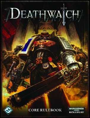
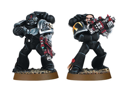
Death Watch

Death Watch Cover Death Watch Minis


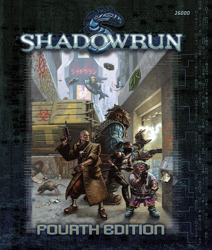
Shadowrun

Shadowrun Cover


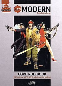
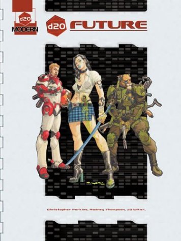
D20 Modern / Future

D20 Modern Cover

D20 Future


Dogs in the Vineyard

Dogs in the Vineyard Art


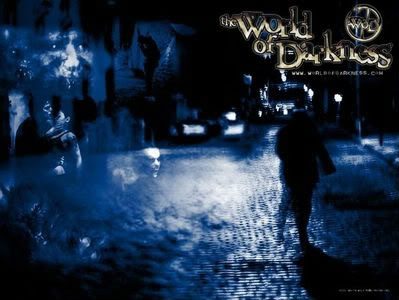
New World of Darkness

New World of Darkness cover art


Exalted

Exalted cover


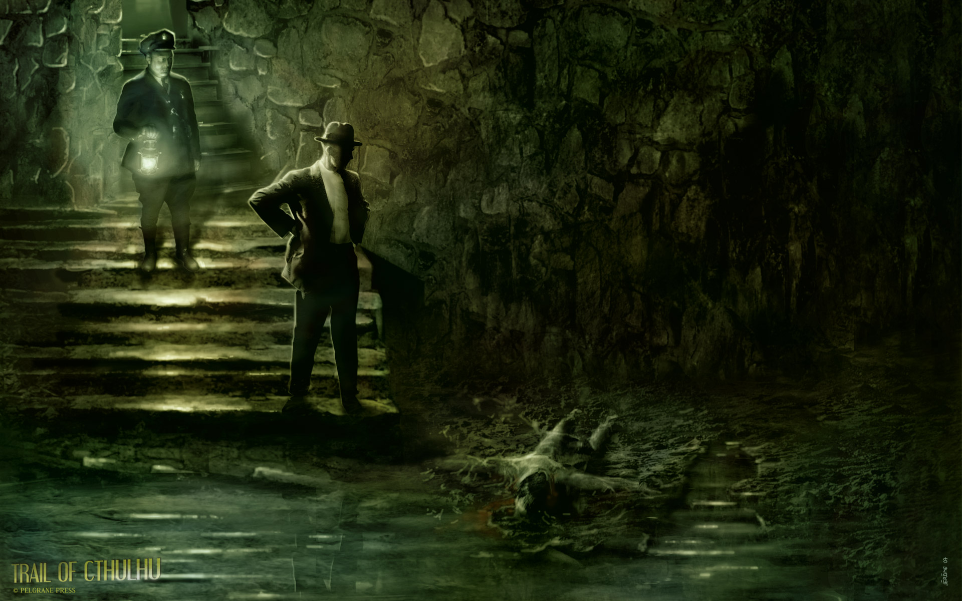
Trail of Cthulhu

enter image description here

That's just a small sample. I've made this post CW so people can add any art they would find evocative. Keep in mind this is things that aren't typical fantasy games.

\$\endgroup\$
2
  • \$\begingroup\$ Ross, thanks! these are helpful. I think I may take a trip to the local gameshop for some inspirations.. yay field trip. \$\endgroup\$
    – Jin
    Commented Dec 2, 2010 at 4:05
  • 1
    \$\begingroup\$ +1. Shadowrun is a great source to draw from because it incorporates fantasy elements in a cyberpunk setting. Rifts is also a good one. \$\endgroup\$
    – RMorrisey
    Commented Jan 10, 2011 at 14:26
2
\$\begingroup\$

I tend to prefer Spartan designs to cluttered things. I would rather see a clean and slick design rather than a over burden one.

\$\endgroup\$
1
  • 1
    \$\begingroup\$ +1. The "falling stack of dice" idea accompanied by a slick, minimalistic design, maybe old paper or something, is all I need to be happy :) \$\endgroup\$
    – OddCore
    Commented Jan 12, 2012 at 15:56

You must log in to answer this question.

Not the answer you're looking for? Browse other questions tagged .