4
\$\begingroup\$

This answer to a question about which colors correspond to which colleges in the D&D 5e book Strixhaven: A Curriculum of Chaos includes numerous images of the 5 colored mana symbols from Magic: The Gathering.

However, on the mobile version of the site, there are some new lines that makes the answer really hard to read:

Screenshot of linked answer in mobile view, showing each colored mana symbol image appearing on its own line

\$\endgroup\$
4
  • 1
    \$\begingroup\$ They're just images, so I suspect something (setting/browser) makes all images be centered on their own line, not sure this on SE's end as I don't think there's anything different between desktop and mobile pages anymore (something something responsive pages)? \$\endgroup\$
    – Someone_Evil Mod
    Commented Dec 20, 2021 at 16:35
  • \$\begingroup\$ They appear properly inline on Chrome for me on desktop, and appear correctly on phone when I check off the "Desktop Site" option in chrome on my phone. \$\endgroup\$
    – Andrew
    Commented Dec 20, 2021 at 17:02
  • 1
    \$\begingroup\$ Someone_Evil already alluded to this, but to be clear: RPG SE doesn’t have any special functionality for Magic icons. I think B&CG does or did, but we never have. That answer just included those images as they would any other image. \$\endgroup\$
    – KRyan
    Commented Dec 23, 2021 at 3:27
  • \$\begingroup\$ @KRyan we don't have any special markdown at BGSE for magic symbols (we probably should) I use the same image links in my posts there that I used here. \$\endgroup\$
    – Andrew
    Commented Mar 8, 2022 at 14:26

1 Answer 1

7
\$\begingroup\$

You appear to be using the deprecated mobile view.

See this meta.se: Deprecating our mobile views

This creates a couple of issues. First, if you’re adding a feature to an existing part of the site, you have to build two separate front-ends—one for mobile, and the other for our desktop view. This introduces more opportunities for bugs, and has even introduced some security holes over the years. Our teams are full of busy humans, and it’s tough to execute, test, and deliver a single website, let alone separate ones.

Second, this creates an inconsistent experience for our user. The mobile views are generally more simple than the desktop views. Certain features have been left out of mobile over the years, others were shipped and unshipped. Others just never got built for mobile users. Over the years, the aesthetics between the two views have drifted.

When using the deprecated mobile view, I get the same view you have:
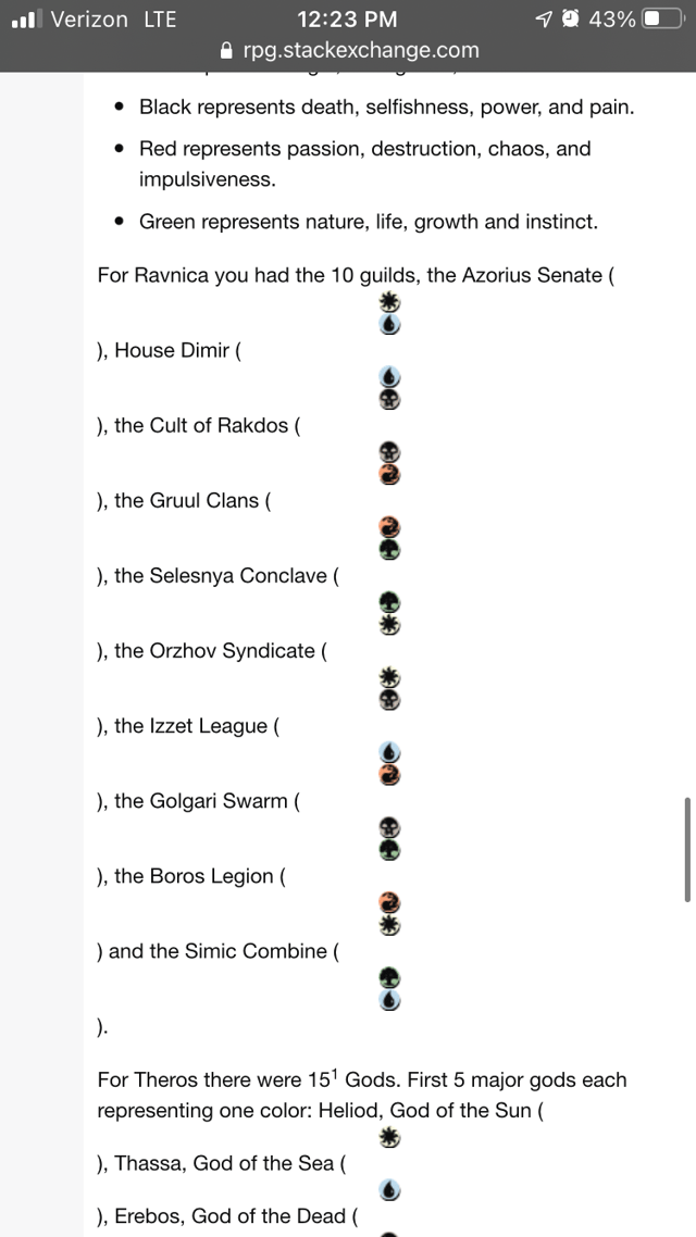
enter image description here

When I switch to the desktop version I get this:

enter image description here

\$\endgroup\$
3
  • \$\begingroup\$ It might be worth explaining how to turn the deprecated mobile view off, cuz it’s not particularly well-documented. (There’s a “full site” link in the footer that turns it off... for a while. Every so often I revert to the deprecated view and have to click it again.) \$\endgroup\$
    – KRyan
    Commented Dec 23, 2021 at 3:24
  • 1
    \$\begingroup\$ @KRyan: Looks like there's a corresponding bug report on MSE about that last part: Occasionally reset to mobile view on phone \$\endgroup\$
    – V2Blast StaffMod
    Commented Dec 23, 2021 at 18:54
  • 1
    \$\begingroup\$ @V2Blast Yup, I would have guessed there was. Ultimately, it’s probably controlled by cookies, which periodically expire/get wiped, and that’s what’s causing it, so it’s not really a bug per se, but rather that they aren’t putting a lot of work into polishing this temporary situation. \$\endgroup\$
    – KRyan
    Commented Dec 23, 2021 at 18:57

You must log in to answer this question.

Not the answer you're looking for? Browse other questions tagged .