19
\$\begingroup\$

You may have noticed some updates to the design lately, they are part of a SE network-wide update to a new base css framework.

The updates allow us to:

  • Have sharper / more beautiful design on retina displays
  • Fix layout bugs
  • More easily add new features to all of our sites in the future

But more importantly, it gives you access to the new profile!

If you see any bugs please let us know in the form of answers (to this post) that illustrate one particular thing at a time.

Thanks!

\$\endgroup\$
5
  • 1
    \$\begingroup\$ [Related] When are we getting the new user pages? \$\endgroup\$
    – SevenSidedDie Mod
    Commented Nov 18, 2015 at 18:30
  • 2
    \$\begingroup\$ I'm looking forward to seeing the headings fixed, or re-reporting their dysfunctionality and then seeing them fixed! (Re: Please fix the spacing for our header styles (it's backwards) and our H3 sizing. Fix suggested inside) \$\endgroup\$
    – SevenSidedDie Mod
    Commented Nov 18, 2015 at 18:33
  • 14
    \$\begingroup\$ “You can please some of the people all of the time, you can please all of the people some of the time, but you can’t please all of the people all of the time.” (I, for one, welcome our new profile overlords.) \$\endgroup\$
    – SevenSidedDie Mod
    Commented Nov 18, 2015 at 19:02
  • 4
    \$\begingroup\$ Let's keep it constructive, everyone. We'd prefer to not delete comments on meta, but we will when they're inappropriate. \$\endgroup\$
    – SevenSidedDie Mod
    Commented Nov 18, 2015 at 20:09
  • 1
    \$\begingroup\$ If you have issues with the design post bug reports, or a separate meta Q for the purpose of complaint, don't clutter the comments here. It makes the actual Q&A harder to use, therefore I have pruned comments. \$\endgroup\$
    – mxyzplk Mod
    Commented Nov 29, 2015 at 0:11

14 Answers 14

19
\$\begingroup\$

We've got rid of Lucitana font and replaced it with Georgia. We haven't changed font size yet, only font face, because we want to see how this gonna work and if it's enough. You will see updated font with upcoming build on production.


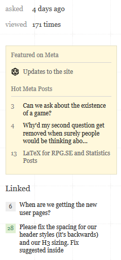
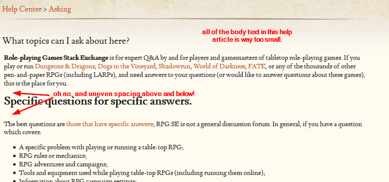
Lucitana 12px: super tiny text in a whole lot of places.

A bunch of places have acquired inconveniently tiny text as a result of Lucitana becoming the standard body font at 12px. It's an unusually tiny font; its 12px is more like 9½px. The newly ensmallened text going to prove hard to read for some people, it's uncharacteristically tiny for a Stack Exchange page, and in some places it looks kinda ugly. Wherever it's bolded, the individual characters turn a bit blobby and become harder to distinguish from each other.

We could benefit from Lucitana being bumped up to 14px, or switching to Georgia for the main body font.

Sidebar

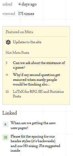
It becomes clear here that Lucitana's so tiny it's losing fidelity: the 'e' is missing its gap, the 't' and 'x' are getting wonky, and combinations like 'Fi' (the very last sentence in the last linked post) just look weird.

enter image description here

If it's set to Georgia, the font used for posts like the one you're reading right now, it's far more legible and looks much better:

enter image description here

Elsewhere in the site

enter image description here

enter image description here

enter image description here

enter image description here

Other impacted spots that could definitely do with larger text:

  • Close vote dialog.
  • A lot of the text in our profile pages: the 'Main User' & 'Network User' links, 'View more' links, the up/down/questions/answers in Votes Cast, just about all of the text in our About More.
  • The explanation text in our tour.
  • The 'more' links in the footer. On the main site they're particularly hard to read.
  • Our review queues. Queue descriptions, all the text on the stats page, the "this queue has been cleared" message.
  • Our comment entry text area. (That overlarge 'x' is bugging me there.)

Here's an example of the overlarge comment-entry 'x':

screenshot of exes from comment entry

\$\endgroup\$
14
  • 3
    \$\begingroup\$ This looks like a designing-for-Retina problem. These things look OK on a Retina screen but muddier on a normal screen. \$\endgroup\$
    – SevenSidedDie Mod
    Commented Nov 23, 2015 at 15:55
  • 3
    \$\begingroup\$ This could also be addressed with font-size-adjust to set font size by the x-height of the fonts, if there is concern about making fallback fonts explode in size. \$\endgroup\$
    – SevenSidedDie Mod
    Commented Nov 23, 2015 at 20:35
  • 5
    \$\begingroup\$ All while writing this, I had Zoolander in my head: "What is this, a site for ants?" \$\endgroup\$ Commented Nov 24, 2015 at 0:21
  • \$\begingroup\$ This becomes worse when certain pieces of text are bold. It becomes near unreadable. \$\endgroup\$
    – Joninean
    Commented Nov 24, 2015 at 12:41
  • \$\begingroup\$ @Joninean Do you have an example? I might add it to the list. \$\endgroup\$ Commented Nov 24, 2015 at 12:45
  • \$\begingroup\$ @doppelgreener In the footlinks there are several bolded links, like contact and feedback, or one of the several more buttons. \$\endgroup\$
    – Joninean
    Commented Nov 24, 2015 at 12:50
  • \$\begingroup\$ @doppelgreener It is not as bad in meta I noticed, but on the main site it looks bad. \$\endgroup\$
    – Joninean
    Commented Nov 24, 2015 at 12:52
  • 2
    \$\begingroup\$ +inf for fixing the exes in comment-entry. Graah! There's two more of them! \$\endgroup\$
    – nitsua60
    Commented Nov 24, 2015 at 15:16
  • 1
    \$\begingroup\$ I was trying to figure out why everything looked like crap and was hard to read. Glad I found this post... \$\endgroup\$
    – DCShannon
    Commented Nov 24, 2015 at 17:38
  • \$\begingroup\$ @nitsua60 and doppelgreener, what over-large X are you meaning? I remember the Georgia giant-lowercase-x problem, but in text entry right here I'm seeing Lusitana's exes behaving properly. Maybe screenshot it? (Aside, looking at the CSS I think comment textareas are supposed to be Consolas… but I'm seeing Lusitana in writing and in FF's computed style.) \$\endgroup\$
    – SevenSidedDie Mod
    Commented Nov 24, 2015 at 18:11
  • 1
    \$\begingroup\$ @SevenSidedDie He has sceenshots of several X's that are disproportionate. It only happens when the text has a certain size. For instance, the Related Questions has small text with disproportionate X's, and the text I am typing right now. (While, after hitting Add Comment, they will be normal size again... Might be the that one pixel that makes the difference.) If the text is bigger, it looks fine again. \$\endgroup\$
    – Joninean
    Commented Nov 24, 2015 at 19:36
  • \$\begingroup\$ @Joninean Yeah, I see them in the screenshots above, just not live here while I'm typing. It must be a resolution thing. (Incidentally, the comment input uses Lusitana but comments are displayed with Georgia, so that's why it would sudden change.) \$\endgroup\$
    – SevenSidedDie Mod
    Commented Nov 24, 2015 at 20:25
  • \$\begingroup\$ We've get rid of Lucitana font and replaced it with Georgia. We haven't changed font size yet, only font face, because we want to see how this gonna work and if it's enough. You will see updated font with upcoming build on production. \$\endgroup\$
    – Paweł Staff
    Commented Nov 27, 2015 at 15:11
  • 1
    \$\begingroup\$ That build appears to be live now! \$\endgroup\$
    – SevenSidedDie Mod
    Commented Nov 29, 2015 at 4:24
17
\$\begingroup\$

It's now fixed as of April 1.


Questions with favorited tags are no longer being highlighted.

enter image description here

It's difficult to get a good screenshot of this, but it's easy to check.

\$\endgroup\$
10
  • \$\begingroup\$ Meanwhile, Ignored Tags are fading correctly. I seem to remember this bug happening before. \$\endgroup\$
    – SevenSidedDie Mod
    Commented Nov 23, 2015 at 16:07
  • \$\begingroup\$ @Pawel any idea when the next production build will happen? \$\endgroup\$
    – Roflo
    Commented Nov 27, 2015 at 15:42
  • 1
    \$\begingroup\$ @Roflo I think today, but you know... so it may also take a little bit longer... \$\endgroup\$
    – Paweł Staff
    Commented Nov 27, 2015 at 15:44
  • 6
    \$\begingroup\$ @Pawel I see all of the other changes listed in this thread, but not this one. \$\endgroup\$
    – KRyan
    Commented Nov 30, 2015 at 15:29
  • \$\begingroup\$ @Pawel This is still is still broken... \$\endgroup\$
    – T.J.L.
    Commented Mar 22, 2016 at 20:03
  • \$\begingroup\$ @T.J.L. that's true. i'm gonna fix it again :) \$\endgroup\$
    – Paweł Staff
    Commented Mar 22, 2016 at 20:09
  • 1
    \$\begingroup\$ @Paweł Thanks for working on this. I think it might not be done yet though: I'm seeing rev 2016.3.23.3373, which is a build date after your comments and [status-completed] edit above, but I'm still not seeing favourites highlighting. Did the fix get into a later build, or is the fix in but not working? \$\endgroup\$
    – SevenSidedDie Mod
    Commented Mar 24, 2016 at 6:28
  • 1
    \$\begingroup\$ Still broken in rev 2016.3.25.3379. \$\endgroup\$
    – SevenSidedDie Mod
    Commented Mar 25, 2016 at 19:32
  • 1
    \$\begingroup\$ This fix should be live in up to ~24h. \$\endgroup\$
    – Paweł Staff
    Commented Mar 31, 2016 at 12:30
  • 3
    \$\begingroup\$ @Paweł It's working! Thanks! \$\endgroup\$
    – Miniman
    Commented Mar 31, 2016 at 14:22
13
\$\begingroup\$

It's now fixed and will be live after our next production build.


Post score and vote buttons are not aligned

Post score and vote/favourite buttons are visually misaligned. Assuredly a minor issue, but it stands out. It's one of those “can't unsee it” things once you notice it.

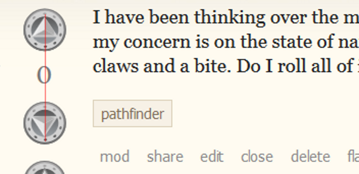
The visual vertical passes to right of centre of the zero here:

The visual vertical passes to right of centre of the zero

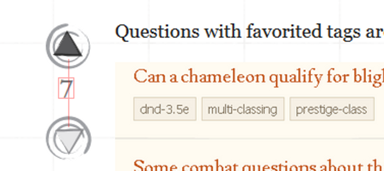
With numbers like seven which don't fill much of the right-hand side of their bounding box the visual vertical misalignment is exaggerated:

The visual vertical passes even farther to the right of centre on left-heavy numbers

Though these screenshots are taken from Win7/Firefox, the same alignment is present on iOS Retina displays.

Additionally the numbers are closer to the upvote arrow than the downvote arrow. The issue is fairly pronounced on meta, less so on main.

\$\endgroup\$
3
  • 3
    \$\begingroup\$ The number 1 is particularly egregious, since it’s so narrow. I don’t think the center line would even touch the actual digit. \$\endgroup\$
    – KRyan
    Commented Nov 23, 2015 at 19:24
  • 3
    \$\begingroup\$ Vote numbers are also closer to the upvote button than the downvote button. It's far more distinct in meta than in main, and you can see it in your screenshots right there. \$\endgroup\$ Commented Nov 23, 2015 at 23:29
  • 3
    \$\begingroup\$ @doppelgreener …Oh yeah. And now I can't unsee that either! \$\endgroup\$
    – SevenSidedDie Mod
    Commented Nov 23, 2015 at 23:32
12
\$\begingroup\$

It's now fixed and will be live after our next production build.


Questions with new answers bar doesn’t stand out as well as it used to

Image of the questions with new answers bar

The gray doesn’t stand out well against the paper-y background. It used to be yellow, and more importantly had a border so it stood out.

\$\endgroup\$
1
  • \$\begingroup\$ Ouch. There's zero contrast there — comparing the bar's #eee to an averaged sample of the background beside it of #f3ede2 gives a 1:1 contrast ratio. \$\endgroup\$
    – SevenSidedDie Mod
    Commented Nov 25, 2015 at 18:57
11
\$\begingroup\$

It's now fixed and will be live after our next production build.


Our main site's footer links are growing envious of the header and appear to be marching upward for battle.

enter image description here

Please subdue them and put them back in place before a war between the header and footer breaks out and destroys the whole page of content between them!

The meta footer links seem OK for now.

\$\endgroup\$
1
  • 1
    \$\begingroup\$ It looks like the root of the problem is the background being pushed down. It should be touching the bottom of the content container above it so that it looks like it's protruding from beneath it (like the header does), but it's disconnected. \$\endgroup\$
    – SevenSidedDie Mod
    Commented Nov 23, 2015 at 23:36
10
\$\begingroup\$

It's now fixed and will be live after our next production build.


Cross-posted from our existing Q&A on the subject, to ensure it’s seen as part of this update.

Heading margins are still reversed, closer to the preceding paragraph than the following one.

p, h1, h2, and h3 all have margin-bottom: 1em; applied. What this means is that, because of their differing font sizes, the margin beneath p is set to 15px, while h1 has 21px, h2 has 19px, and h3 has 17px. As such, all headers are, quite visibly, closer to the preceding paragraph than they are to the paragraph below, i.e. the one they are actually assocated with.

Here’s an example:
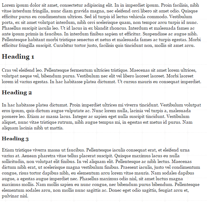

Image of existing heading spacing


This is still quite reversed. All headings should be closer to their associated content than the preceding, not the other way around. As such, 15px should be the maximum margin-bottom on all of the headings, and smaller margins would be appropriate. I understand that there is some matter of preference between equal-distance above and below, versus being closer to the following paragraph, so fine, use 15px if you must: but going above 15px is still terrible.

Here is the same page, but with all margins set to 15px instead of 1em:
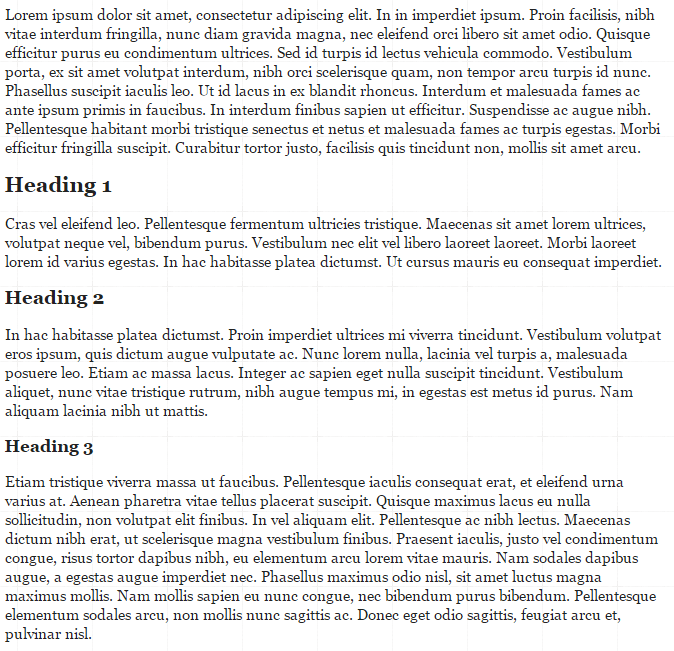

Headings with fixed 15px spacing


Still not a huge fan of that. Note that the margin is calculated from the bottom of the lower extenders (e.g. on the g), not from the base line of the text. As a result, the top of the H is still closer to the preceding paragraph than the bottom of the H is to the following paragraph.

On the other hand, setting the bottom margin on all of the headings to 5px looks quite a lot better in my opinion:
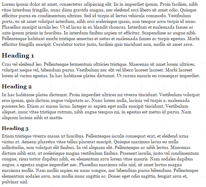

Headings with fixed 5px spacing


Here, the headings have a clear visual association with the following content (i.e. the content they serve as heading for)

\$\endgroup\$
4
  • \$\begingroup\$ Huh. No wonder you noticed it and I didn't. I dunno what it is exactly, but in your screenshots there looks to be a bigger difference by a margin of maybe 2-3 pixels. \$\endgroup\$ Commented Nov 24, 2015 at 0:40
  • \$\begingroup\$ @doppelgreener Well, seen the issue on two different computers, both running latest Chrome. \$\endgroup\$
    – KRyan
    Commented Nov 24, 2015 at 0:47
  • \$\begingroup\$ The issue is more exaggerated in Chrome: I overlayed the two for comparison. They handle their line spacing or something just a little bit differently, and the headers noticeably sit a little bit higher. \$\endgroup\$ Commented Nov 24, 2015 at 1:01
  • \$\begingroup\$ @doppelgreener Ah, yeah, that’s pretty significant. I just checked IE 11 (.0.22), looks like Chrome to me, spacing not right. \$\endgroup\$
    – KRyan
    Commented Nov 24, 2015 at 18:45
8
\$\begingroup\$

It's now fixed and will be live after our next production build.


Post score looks greyed-out

Post score text colour is technically identical to the outer-rim colour of the vote buttons (#777), but because visual colour bleed disproportionately affects thin shapes, the number's colour looks too pale beside the buttons and doesn't visually match.

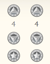
The text colour looks about right around #555. Here's a before and after shot, with post score as color: #777 (current) on left and color: #555 (tweaked) on the right:

Post score is <code>color: #777</code> on left and <code>color: #555</code> on the right.

The 4 on the right looks much more assertive of its existence and right to stand among those design elements than the ghostly 4 on the left.

Other grey text on the page has this “being ghostly” issue too, but only the post score and the favourites count are so close to a non-text element using the technically-same but visually-different grey value that in comparison they look like a different colour.

Compare with here on meta, where text of colour #777 nicely visually matches the lighter button colour of #9ea0a4.

\$\endgroup\$
7
\$\begingroup\$

It is now fixed and will be live after production build.


Margins on lists create empty space in quote box

If you put a list inside a quotebox (i.e. start each bullet point with >*), you get an awkward empty space beneath the list, but still in the quotebox:

Existing margins with blank space

The margin above and below the list inside the quotebox should be the same. Most likely a LESS rule something like this:

ol, ul {
    #:last-child, li:last-child {
        margin-bottom: 0;
    }
}

is the appropriate fix. That would look like this:

Removing final margin to remove blank space

Because of the extender on the 3 there, it looks like a small space may be appropriate, but I still like this much better than the combined 1.5em of final list item and list.

\$\endgroup\$
4
\$\begingroup\$

Major input lag when writing/editing answers in Firefox.

(Maybe Chrome too? I don't know, I haven't tested that one.)

I have no idea what's causing this. I've never noticed it before even on other sites that have redesigns, but maybe I've just never written big answers on those.

When a post becomes decently big, there starts to be a lot of lag between me typing out a word and it appearing on my screen. I'm a fast typist, and it becomes a big problem for me. It makes it very slow just to correct small typos, since I have to wait for the text area to catch up, and then I have to wait for it to process my backspacing, and then I start typing again and waiting for it to catch up.

I installed gifcam to record this happening. The gifs are accurate and real time, the lag you see is real lag, not a problem with the gif.

There's some jerkiness at the very end of that laggy one: I end up highlighting some text somehow at the end while trying to scroll the text area in a very laggy Firefox. The lag isn't jerky though. The text I jammed out in that last gif? I did it by just bashing all the keys rapidly for a few seconds, and then I sat and waited a while for the text entry to slowly fill up with that text.

\$\endgroup\$
8
  • \$\begingroup\$ Hmm.. couldn't reproduce it (Firefox 42.0). \$\endgroup\$
    – Roflo
    Commented Nov 23, 2015 at 15:30
  • \$\begingroup\$ Hmm. Neither can I right now. >:I But it was happening earlier. \$\endgroup\$ Commented Nov 23, 2015 at 15:31
  • 2
    \$\begingroup\$ Maybe you restarted your browser? \$\endgroup\$
    – Roflo
    Commented Nov 23, 2015 at 15:33
  • 2
    \$\begingroup\$ I have seen this from time to time prior to the update, too. I use Chrome. \$\endgroup\$
    – KRyan
    Commented Nov 23, 2015 at 16:04
  • 1
    \$\begingroup\$ I have consistently had this problem in Safari and FF on a 2007-era MacBook for a couple of years now. I think something in the JS code gets inefficient in longer posts and noticeably taxes lower-performance environments, and the layout might be exacerbating the bug. Not looking forward to editing on my laptop… \$\endgroup\$
    – SevenSidedDie Mod
    Commented Nov 23, 2015 at 16:10
  • \$\begingroup\$ I can't reproduce this on Firefox(42.0, OSX). However, FF has always been a memory hog for me if I leave a few tabs open, especially those tabs are of Google Docs or Spreadsheets. If this happens again, do you mind checking how much resource FF is eating? When FF bogs down for me, every site on the internet lags \$\endgroup\$
    – Jin
    Commented Nov 23, 2015 at 16:26
  • \$\begingroup\$ @Jin For now I'm just getting lag that seems to be entirely Firefox updating the post preview, and the performance tool isn't shedding much light. Hm... maybe that accumulated after a whole lot of writing and editing posts. \$\endgroup\$ Commented Nov 25, 2015 at 4:27
  • \$\begingroup\$ This happens on even short posts that contain images: every keystroke flickers the images off and on, and delays being able to type the next keystroke until the re-render is done. That points to something going wrong in the preview rendering code. \$\endgroup\$
    – SevenSidedDie Mod
    Commented Mar 25, 2016 at 19:31
3
\$\begingroup\$

Visited tags are displayed with the link color, rather than the standard link appearance: will be grey right now, but when you visit it, it'll turn gold here, or red on main site. If you clicked that too soon, try or delete the page for one of these made up tags from your history.

It doesn't show up this way in post previews, which are always just grey, regardless of visited-ness. That's how it used to be, so this changed during the redesign.

This affects the appearance when visiting a tag without a tag wiki:

enter image description here

enter image description here

Apparently this might just be a feature of the redesign though, since it occurs this way too on Meta Stack Exchange:

enter image description here

(usual tag appearance is grey)

\$\endgroup\$
4
  • \$\begingroup\$ I can no longer see this happening. Is it status-completed? \$\endgroup\$
    – Roflo
    Commented Nov 30, 2015 at 17:14
  • \$\begingroup\$ This is still happening. \$\endgroup\$ Commented Dec 1, 2015 at 3:57
  • \$\begingroup\$ My bad, I tested the links during edition (post preview) instead of fully posted. \$\endgroup\$
    – Roflo
    Commented Dec 1, 2015 at 15:15
  • 1
    \$\begingroup\$ It's still inconsistent, if it's different in the preview. And if you click on something like (discussion) on Meta.SE, you'll see that the top instance of the tag in “About (discussion)” is grey while the bottom instance in “(discussion) is one of the four possible mandatory tags” is blue. That inconsistency may be a (minor, deferrable/ed) bug in the wider LESS stylesheets. \$\endgroup\$
    – SevenSidedDie Mod
    Commented Dec 1, 2015 at 21:47
3
\$\begingroup\$

It's great that the site notice is no longer broken, but it still doesn't look as nice as it was originally designed to look.

Current site notice appearance:
Current site notice

What the site notice could look like, with a few CSS tweaks:
Fixed site notice appearance

I realize that this is a minor detail, and most users will never see it anyway. But it would still be kind of nice to have.

\$\endgroup\$
2
  • \$\begingroup\$ No longer buggy functionally, but looks like maybe not the intended design — I think that counts as a potential design bug worth reporting, yes. \$\endgroup\$
    – SevenSidedDie Mod
    Commented Dec 5, 2015 at 23:20
  • 2
    \$\begingroup\$ Other sites have adopted the plain solid-colored rectangle, which seems like a good idea -- we don't want it to blend in with our navigation bar if it's supposed to be an alert, it needs to stand out and grab peoples' attention -- only it picked up the ordinary background color, instead of one that will stand out. \$\endgroup\$ Commented Dec 6, 2015 at 3:31
3
\$\begingroup\$

Vote numbers in the close vote dialog are extremely tiny.

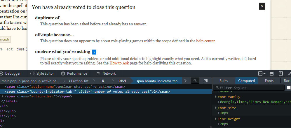
Like, this tiny: 1 2 3 4, vs regular size: 1 2 3 4.

They're sized at 10px in the vote dialog, while the text around them is 13.65px. The 10px would probably be fine on other sites, but Georgia uses lowercase numerals. (Which is awesome. I wish more fonts did that.)

I think they were still pretty small before, but either I've only really noticed how small now, or they've become smaller during the redesign.

unclear what you're asking. (very tiny 2.)

As SSD points out in comments, this also affects our featured count:

5 featured, with the number being quite tiny

\$\endgroup\$
1
  • \$\begingroup\$ The Featured tab's count on the main page also suffers alignment issue from the text figures. \$\endgroup\$
    – SevenSidedDie Mod
    Commented Dec 8, 2015 at 1:50
2
\$\begingroup\$

It's is fixed now.


The icons are stretched and cut off along the bottom using Chrome version 46.0.2490.86 (64-bit) on a 15-inch retina macbook pro, though it seems to occasionally correct itself. Safari and Firefox both seem fine so it's possibly more-so a problem on my end since we do have a lot of internet troubles at work.

It also works fine on my iPad mini and windows PC at home. Have not checked my laptop at home yet.

SE Community Hot Network Questions

\$\endgroup\$
2
  • \$\begingroup\$ I can't reproduce it (under Firefox 42). Perhaps you should mention which browser you're using. \$\endgroup\$
    – Roflo
    Commented Nov 26, 2015 at 15:32
  • \$\begingroup\$ @Roflo updated with details. Seems that it may just be a problem on my end, at work, if it can't be reproduced. \$\endgroup\$ Commented Nov 26, 2015 at 21:53
1
\$\begingroup\$

Our Filter button in the review queues is floating away. Not sure if this is a big deal?

RPG.SE:

enter image description here

vs Meta.SE, where it's at least sorta in line with the heading:

enter image description here

\$\endgroup\$

You must log in to answer this question.

Not the answer you're looking for? Browse other questions tagged .